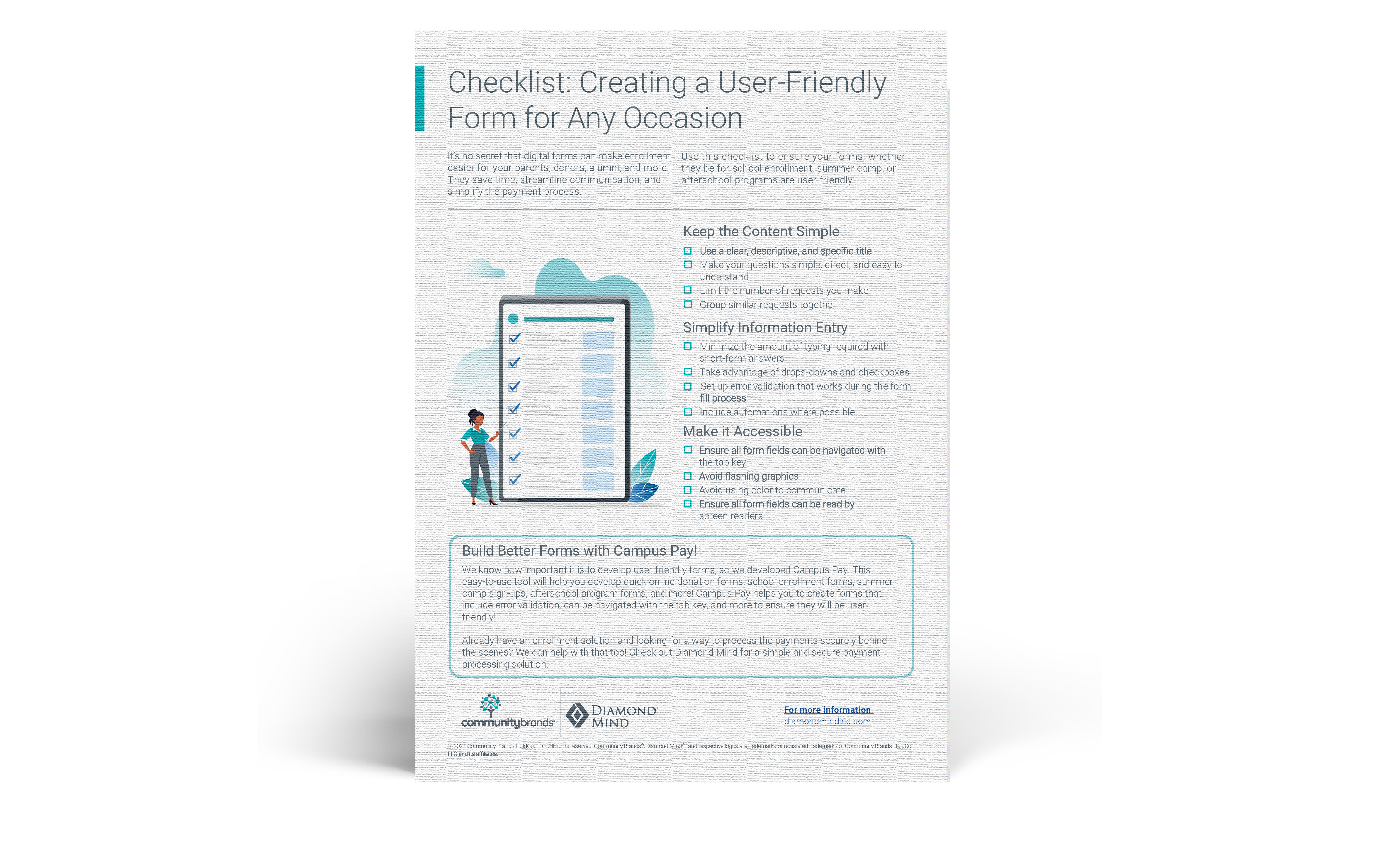
The ability to take payments online is increasingly important for schools. Take the time to make your online payment processes as painless as possible by ensuring your forms are user-friendly. This will help increase form usage and improve your school’s reputation with families. Here are our top 3 recommendations for creating a user-friendly form.
Keep the Content Simple
Don’t overwhelm your users with too many questions or too much content, no matter how tempting it is. Keep your form simple using the following tips:
-
Use a clear, descriptive, and specific title to help the user understand what the form is about and help to set expectations.
-
Ask the bare minimum number of questions necessary to avoid overwhelming the end-user and making them frustrated.
-
Make your questions simple and direct.
-
Group similar requests together to make it easier for users to focus on what is being asked.
Simplify Information Entry
No one likes filling out long, complicated forms. Make the actual information entry as simple as possible to create a smooth form fill process.
- Minimize the amount of typing needed by avoiding long-form answer choices. Instead, use easy to complete options including short-form text responses, drop-downs, and checkboxes.
- Set up error validation that works during the form fill process. Don’t wait until the user has tried to submit the form to let them know something is wrong. Take advantage of error validation technologies, such as including required fields while building your form.
- Include automations where possible. The fewer items there are for a user to fill out manually, the easier the process is on them.
Make it Accessible
An important and often overlooked part of making an online form user-friendly is making sure it’s accessible to everyone. Consider users who may have to use different tools, such as a screen reader or keyboard navigation, as you build your form.
Below are some good best practices to stick to when building an accessible form:
- Ensure all form fields can be navigated with the tab key. Keyboard navigation is a quick way to navigate a form or page without the use of a mouse. It can be helpful for those who have a visual or motor function impairment
- Avoid flashing graphics. Flashing graphics can trigger seizures in certain individuals. Keep your form simple with static graphics where graphics are necessary to avoid this risk.
- Think carefully about your use of color. Visually impaired or colorblind individuals may have trouble finding color on a page and miss the communication.
- Ensure all form fields can be ready by screen readers. Many visually impaired individuals will use screen readers when navigating online.
Creating a user-friendly form is a key step to ensuring your school is ready to accept payments online, so that whatever may come, you are prepared.
Interested in making your own user-friendly forms?
Schedule a demo for CampusPay!
This easy-to-use tool will help you develop quick online donation forms, school enrollment forms, summer camp sign-ups, afterschool program forms, and more! Campus Pay helps you to create forms that include error validation, can be navigated with the tab key, and more to ensure they will be user-friendly!

